Request For Services
I can’t wait to help your vision come to life!
To better understand your request, and to confirm if I am just the right fit, please fill out the form below with as much information as possible, and I’ll be in touch!
I can’t wait to help your vision come to life!
To better understand your request, and to confirm if I am just the right fit, please fill out the form below with as much information as possible, and I’ll be in touch!

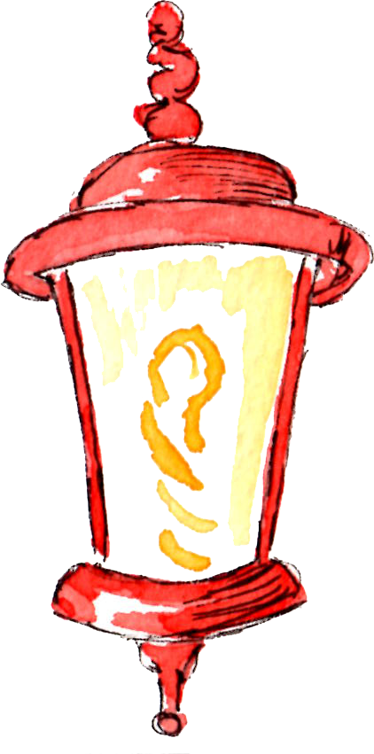
You know when you start to get that feeling creeping up that you’ve been doing something all wrong? I just realized I have been doing that with Pinterest. I’ve been idly scanning my way through the main page for years, pinning things as they came to me. Last night I decided to scroll through my own pins in a moment of boredom. And stumbled on an article about tricks with watercolour, which led me to an entire blog about architectural rendering in watercolour. Oh. Look at that. I even had the foresight (go me!) to have an entire Pinterest board dedicated to Illustration References. What do you think that board was doing? Aside from collecting internet dust it has an absolute ton of tutorials for me, just waiting there.

I asked for a number of books for Christmas and the one I’m currently puzzling through is Betty Edwards “Colour: A course in mastering the art of mixing colours”. It’s a good one. I actually remember using her first big book, “Drawing on the Right Side of the Brain” in high school. It’s a really well written book, as is the new colour book. It is fascinating to learn new things as an adult. But I have to keep taking breaks to let it sink into my brain, and to do some experimenting with my own paints as she more or less insists on. And the insights I’ve gained so far – wow! Just this morning I mixed two colors that have already been sitting in my palette all this time. I can safely remove the pre-mixed ones to make room for other colours I’ve been missing. I also washed and reorganized my palette – see?

I laughed out loud at myself doing this. I didn’t want to use soap because I don’t want to affect my painting area – it drives me crazy when colours pool but won’t spread. I used Q-tips to get into the corners of the mixing area where old colours were stored. Normally I leave my mixed colours on my palette, allowing them to dry there for later re-use. I suspect I’ll keep this habit up as I feel it lends consistency to my paintings.
I don’t think I ever changed it out of the order it came in. Then last year I met a very nice dude named Ernest in our one sketching encounter together and he was very kind to give me a small palette of 8 artists grade watercolours. Cue #2 on what i was missing out on. Other than my travel palette I have not bought new paints for myself ever, really. I’m using tubes my mom gave me as a Christmas gift when I was 17. Yes, they’ve lasted half my lifetime. But they must have been student grade paints – artists grade, I have learned, pack the pigment much looser so it takes a lot less water to wake up the colours in the palette. I’m still learning my way through this though – the first time I tried using just the artists grade colours, the brightness damn near scared me away 🙂 I was juggling two palettes for a few months, which did not fit comfortably at all into my travel kit, but finally had the insight to combine both palettes. Lightbulb moment, I tell you…
But back to that palette reorg. Before they were more or less just plugged in where I thought they fit. Now I’m trying to follow the colour wheel while making sure that complementary colours are across from each other. Let yellow fade to browns, purple into reds, and make sure purple is across from yellow. There were a few duplicate colours I took out, although side note – Burnt Sienna is very different across brands, and in this case I actually really prefer my Windsor & Newton one! I’ve added in a proper violet as well as Prussian blue, and there is a blank yellow pan waiting for Naples Yellow. I have seen other artists use it and really love it’s warmth.

I really want to integrate more colour theory into my works this year. I found one image on this guy’s blog – check out those tree trunks. They’re mostly yellow fading into purple, no brown or grey in sight. Amazing what our brains are just hard wired to see after awhile, huh?
As a side note, Frank had a good laugh at my expense this morning. One of the other books I asked for this Christmas was the Marie Kondo book “The Life Changing method of Tidying up”. I went on a three day house purge following that and I still feel refreshed and lightened from it. Yet, here I was this morning, just agonizing over removing one of my four shades of red to replace it with purple. Frank said it was almost tweet-worthy that I could throw out half of my clothing without second thought – but remove one red from a colour palette and I was just frozen. I guess it does let me know where my priorities are these days. 🙂